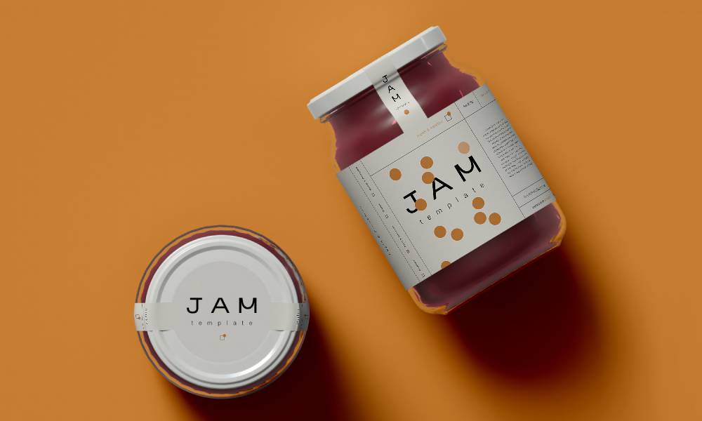
When you’re in the process of creating packaging for your product, the myriad of design choices you face can be overwhelming. Among these choices is the type of font you’ll display. Figuring out how to choose the best font for your packaging can be tricky with so many options available. However, there are simple ways to narrow down your best choices. Read on to learn how to select a font that strikes the balance between aesthetics and functionality.
Understand Your Brand Personality
The fact that product packaging can convey your brand’s personality is one of the reasons packaging is important for business branding. To convey this personality, every aspect of your packaging comes into play—including the font. Therefore, the font you select should reflect your brand’s personality.
If your brand is all about elegance and luxury, you might lean towards serif fonts that embody sophistication. Conversely, a brand that prides itself on being modern and forward-thinking may find a cleaner, sans-serif font to be more appropriate. Understanding your brand personality is the first step in narrowing down your font options.
Consider the Product and Its Audience
Who are your customers, and what is your product? The font for a children’s toy packaging will vastly differ from that of an upscale skincare line. The key here is to align your font choice with both the product’s nature and its intended demographic. A fun and whimsical font could resonate well with kids, while adults might appreciate something sleeker and more minimalist.
Make Text Clearly Legible From a Distance
Your packaging’s font needs to be clear and legible from a moderate distance. This ensures that even at a glance, potential customers can easily read and understand the information presented on your product’s packaging. Legibility is essential for both large text, like the product name, and smaller text, such as ingredients or usage instructions. This clarity will ensure your product packaging stands out and offers the customer confidence in your business. If a customer can’t easily read what’s on the package, they’re likely to move on to another product that doesn’t make them squint.
Match Font Size With Packaging Space
The size of your packaging plays a big role in dictating the appropriate font size. Large packaging offers more space and thus can accommodate larger, more decorative fonts. Smaller packages, however, require more careful selection to ensure that the text fits well and remains legible. It’s a delicate balance between making use of space and ensuring the text is easily readable.
Pay Attention to Color Contrast
The color contrast between the text and the packaging background can significantly impact legibility. A high contrast, such as black text on a white background, makes for easy reading. Meanwhile, low-contrast combinations might look aesthetically pleasing but can be challenging to read, especially under poor lighting conditions.
Test Your Packaging Under Different Conditions
Before settling on a final font choice, test your packaging under various conditions. Look at it from different distances and in different lighting situations. Perhaps even ask for feedback from a sample of your target audience. This testing phase can uncover readability issues that weren’t apparent during the design stage.
Though a small detail, packaging font can boost your brand’s quality and marketability in the eyes of your customers. Now that you know how to choose the best font for your packaging, you can pick a design that looks good, showcases your brand, and contributes to customer satisfaction.
- 3 Tips for Making Manufacturing Maintenance Easier - May 8, 2024
- Why Is It So Hard To Start a Business in California? - May 8, 2024
- 3 Cost-Effective Ways To Promote Your Business - May 8, 2024
