

You probably know by now that an outdoor sign is a necessity for a business because you would need a sort of identification or a marketing strategy that works effectively 24/7. But what if we tell you there’s a better way to up your signage game by incorporating concepts to enhance its impact? Yes, we can! If you feel that you think your sign needs something more – some upgrade on its theme, well, that is entirely possible. Just hold on to your creative ideas and let a credible metal craft professional bring those ideas to life. Whatever design you aim to include, ensure that it remains connected to your business coverage.
Although one simple outdo or sign can suffice if you’re looking to promote your business, it does not simply mean it can immediately attract several customers all at the same time. Start by reviewing the entirety of your sign. Just by looking at it, ask yourself if the elements in it are enough to catch the attention of passersby? Put yourself in their shoes, would it be something that would instantly stop them at their tracks and pique their interest in the services you offer? Run through your ideas and assess which parts should go in the signage. However, if you’re entirely clueless on what to do or nothing comes to mind, you can just browse through the Internet to look for inspiration or ask for a professional to assist you regarding the improvements that may be done on your signage.
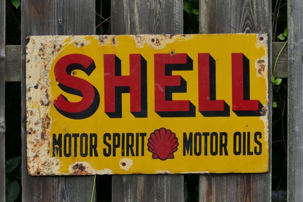
If you’re struggling to find a theme, then why not incorporate the retro concept? It has been making its comeback especially the aesthetic appeal of businesses particularly in the field of fashion and interior design. This whole theme is featured on almost all mediums of art existing out there, such as painting, television shows, and physical products. It is a common fashion trend as well because of the interesting combinations of color and figures. You will surely have fun integrating retro elements into your signage and would naturally grab the attention of potential customers. It’s a common misconception that retro itself is similar to vintage which is a specific style but it needs to be clarified that the latter is a compilation of past decades of styling concepts. The word ‘retro’ is just a collective term used to describe the concepts and trends of the previous years. However, the common retro style people are more inclined to the styles during the 1950s – 70s. It is also often exchanged with vintage style, a trend that made its mark during the 1920s and later. But it should be understood that these terms refer to the age of the object, not the style itself. To provide additional tips on what to do to refine your signage, we’ve put together things you could do to come up with better and creative ideas.
Experiment with different retro trends
There are different takes on the retro concept on the Internet and decide which one suits your taste the best. It has to be reflected on your signage as well. Moreover, it has to look like you were able to complement the nature of your business and not as if it did not go well with the theme of your services. You have to convince your buyers that the concept is associated with your products and in what way.
Be specific with what you want to see in your sign
Where do you want your newer features incorporated? Is it in the lettering? The design layout? Or on the material itself? It is better to Indicate where you have decided to include because even the smallest detail is taken into account especially when you have finalized the entire layout. Once it is ready for customization, you can never edit it back once you think of last-minute changes to put. So be sure of what you planned, as much as possible, keep revising and reviewing your ideas. We advise that you allot more time in this part of the process.

Check out sample retro fonts, images, or layouts
There are numerous fonts that you could choose from as well as color palettes that could be added to your outdoor signage. Of course, if you want your sign to stand out from the rest of your competitors, then include some elements that would level up your sign’s impact. Potential buyers are usually attracted to those with colorful details on the signage but – the emphasis is on ‘but’, they would naturally be curious about how those features relate to the business you handle. What do those colors have to do with your services? This is why picking a color combination does not only mean selecting the ones that speak too much on the eyes. It’s about working on how the colors chosen are able to speak out on what you intend to convey. This goes the same way for the images and figures you’ve put in the signage. What is the significance of these elements? Once you are able to clear things up and come up with decisions of which features to push and to give up, then you’re good to go.
Final thoughts
With all the trending styles and concepts out there, industries may find it hard to stick with a theme that would differentiate them from the others. That is why it is recommended to do some intensive research on what are trends and how to deviate from those mainstream styles in order to create a fresh but unique concept that does not look too out of place. Businesses have to consider that the competition is not only focused on the products or services they provide but also on how they market their name publicly. For this, they can rely on ShieldCo rusted metal signs, bringing their retro approach to their signage flawlessly. With ShieldCo, their take on the retro style is applied to their product works along with guaranteed exceptional quality that surpasses other metal craft industries. Depending on what retro characteristics you wanted to see on your metal piece, they can grant your requests through their excellence in craftsmanship and professionalism.